The journey to a unified Stellenbosch University brand: Ceremonial Emblem
Prof Hester C Klopper, Deputy Vice-Chancellor: Strategy, Global and Corporate Affairs, and the Corporate Communication and Marketing Division (CCMD) are pleased to announce that Council has approved the new ceremonial emblem for Stellenbosch University.
The new ceremonial emblem is a visual and symbolic continuation of our new corporate logo. Both reflect Vision 2040 and unequivocally represent our commitment to transformation.
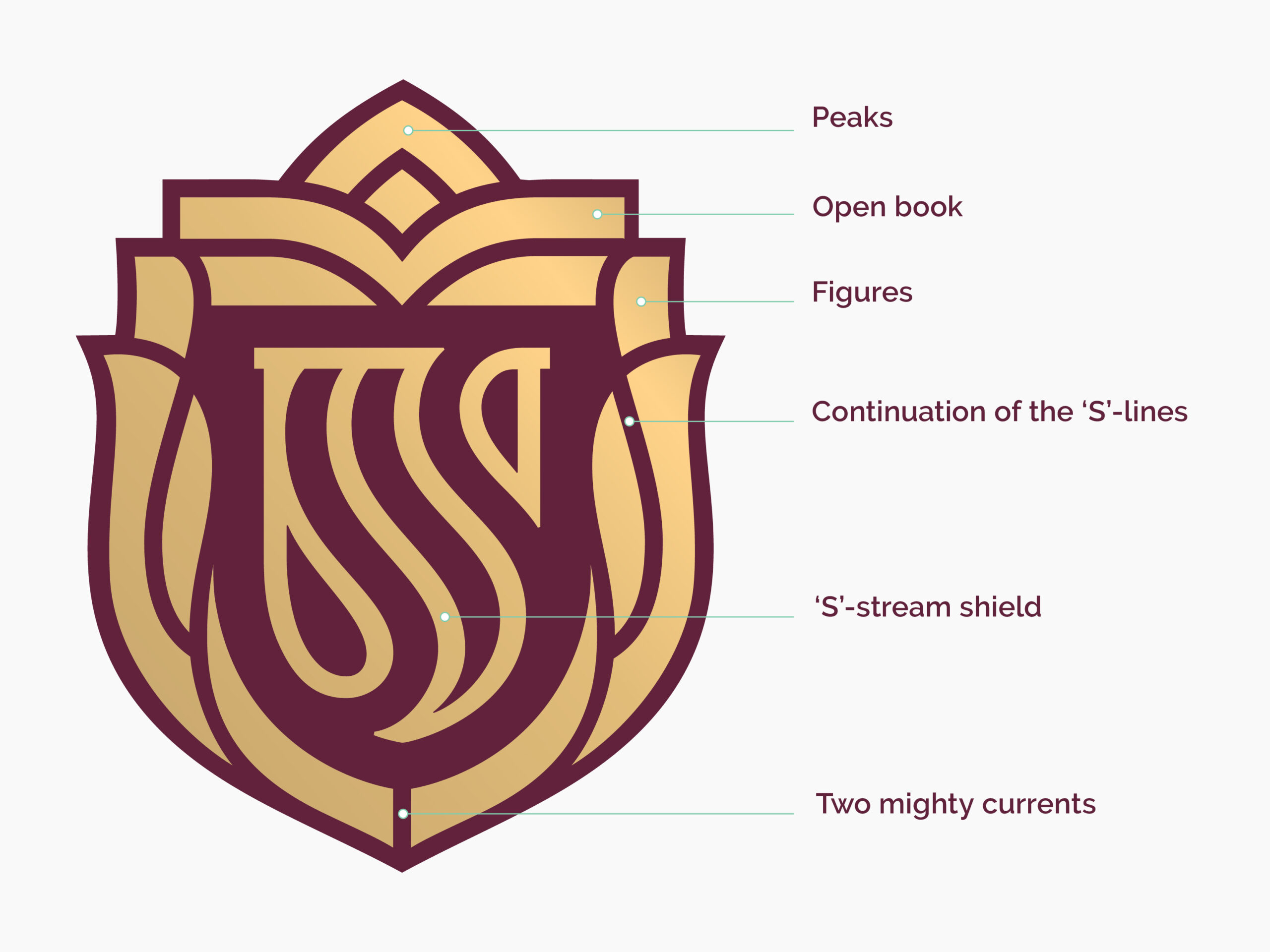
Ceremonial emblem design elements
The ceremonial emblem consists of the following design elements:

Two mighty currents
The design conceptually begins above the motto, from where two streams weave symmetrically upwards around the ‘S’-stream shield. The shield, in this instance, could represent the southern tip of Africa, with two mighty currents flowing around it – one cold and one hot – denoting the nature of the dialectical process. The streams are in perfect equilibrium, which is vital in charting Stellenbosch University’s path of progress towards its Vision 2040 and beyond.
‘S’-stream shield
The ceremonial emblem is built around the ‘S’-stream shield that functions as Stellenbosch University’s public-facing brandmark. The design is rooted in African line art: The ‘S’-shaped lines are inspired by the first mark-making techniques found in the petroglyphs along the Gariep River, Driekopseiland and Nooitgedacht glacial pavements. The rhythmic effect of the lines symbolises the warmth, vibrancy and rhythm of the African continent, and the dynamic creativity of Stellenbosch University and its people.
Continuation of the ‘S’-lines
The continuation of the ‘S’-lines along the sides of the shield can be interpreted in a number of ways – as upward flowing streams, the vines of a plant, or even the spines of two highly abstract figures.
Figures
The block shapes on either side of the shield can be interpreted as the heads of two anamorphic figures that serve as supporters around the shield. These are intentionally highly abstract, inviting the viewer to make visual leaps as to what they represent. This approach conveys that the University embraces diversity and is committed to creating an inclusive and a socially connected and vibrant campus learning community, with teaching practices that respond to various contexts.
An open book
An open book, the traditional symbol of knowledge, is stylised in a contemporary way to convey Stellenbosch University’s commitment to academic excellence through the cultivation of critical thinking, where ideas and imagination can thrive. It represents the University’s mission to enrich and transform local, continental and global communities by making meaningful contributions of the highest quality.
Peaks
The emblem is capped off by peaks, or a single destination. It symbolises the University’s commitment to move humankind forward together through purposeful connections and critical thinking that shifts boundaries and perceptions.
For enquiries about the brand:
Brand Management Unit
branding@sun.ac.za
Corporate Communication and Marketing Division
For media enquiries:
Martin Viljoen
media@sun.ac.za