Rebranding Stellenbosch University together
The journey to a unified Stellenbosch University brand
Prof Hester C Klopper, Deputy Vice-Chancellor: Strategy and Internationalisation, and the Corporate Communication and Marketing Division (CCMD) are pleased to announce that Council has approved a new visual identity for Stellenbosch University (SU). This includes a new logo and brand positioning strategy that are aligned with SU’s Vision 2040 and Strategic Framework 2019–2024. The new logo will replace the ‘S’-leaf logo, which has been in use since 2000.
Rebranding an institution is no simple task: It is one of the most visible institutional strategic initiatives embarked on at SU in recent years, and has a university-wide impact. For that very reason, this is indeed only a reveal of the new logo. Much work remains to be done before we can start rolling out the new visual identity. The final phases of the rebranding project will now follow, which will culminate in an official launch of the new visual identity and implementation across SU.
Look out for communication in this regard in the months ahead.
Introducing our new logo
We are grateful for all the valuable input that we received on this transformative rebranding journey. Thanks to the critical insights of our staff, students, alumni and extended stakeholder community, we are now able to reveal our new and approved visual identity.
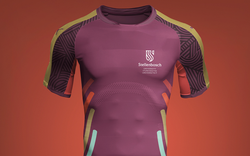
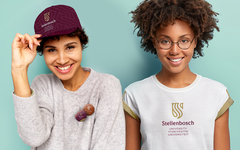
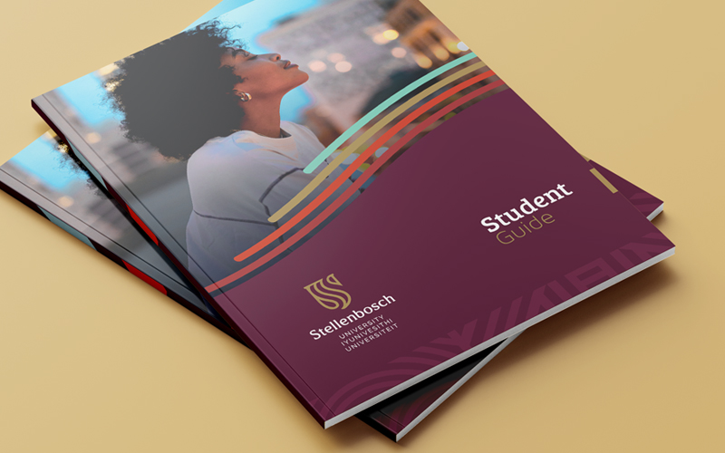
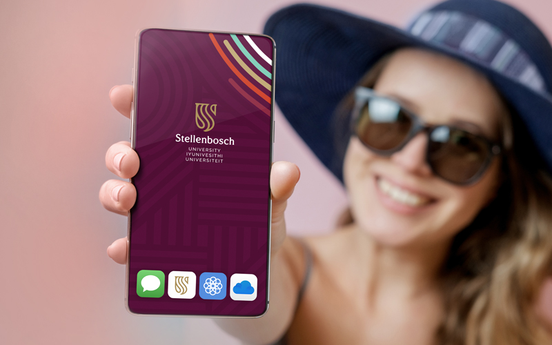
The new SU logo consists of both a visual and written component.
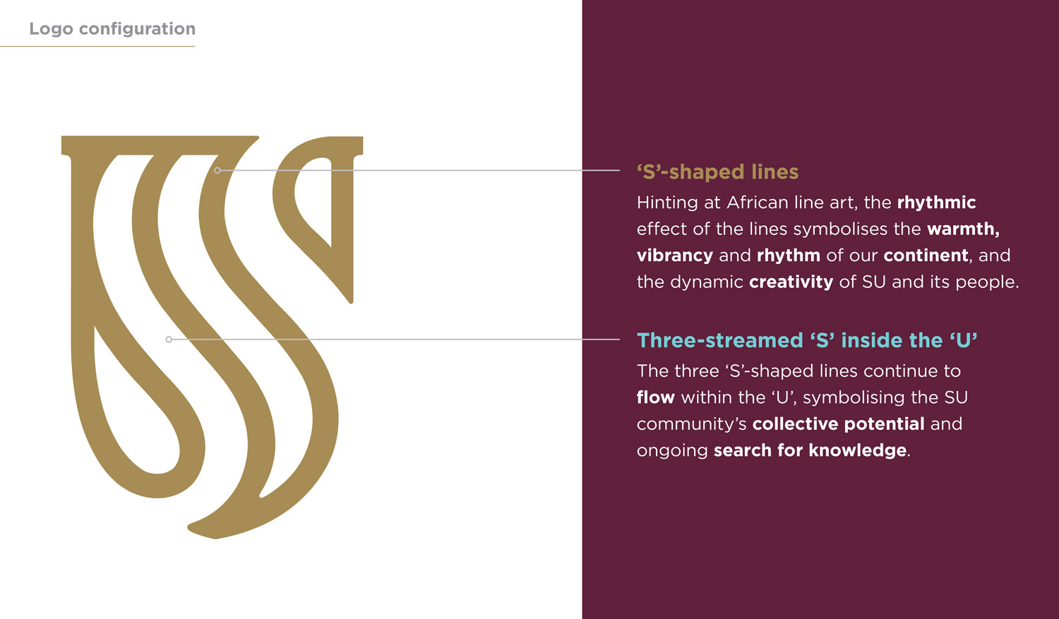
The visual component has two elements: Firstly, lines in the shape of an ‘S’ (for ‘Stellenbosch’) signify the warmth, vibrancy and pulsing energy of our African continent. Secondly, these lines form three streams that flow continuously within a ‘U’ (for ‘University’), symbolising our collective potential as a community.
In terms of written content, apart from the stylised abbreviation ‘SU’, the new logo contains the word ‘Stellenbosch’, followed by ‘University’ in each of the three languages used by the institution, namely English, isiXhosa and Afrikaans. Accompanying the logo is SU’s institutional slogan, again in the University’s three languages – ‘forward together, sonke siya phambili, saam vorentoe’.
The new logo is modern and streamlined, yet classic and elegant. It is also legible, clear and recognisable, as befits a world-class academic institution aspiring to be Africa’s leading research-intensive university by 2040.
Extensive engagement for broad buy-in
As the rebranding process evolved, extensive engagement ensured that our stakeholders remained part of the process every step of the way. Stakeholder consultation took place in two phases – one before logo design started (concluded in November 2020), and another after a few options had been designed (January and February 2021).
Before design started, SU’s faculties, Visual Redress Committee, Institutional Transformation Committee, Students’ Representative Council and alumni were invited to online engagement sessions. These were conducted in an inclusive and consultative spirit. The online sessions were followed by an electronic survey, which was open to all staff, students, alumni and Council members. A total of 1 075 people had their say before logo design started, which served as the basis for establishing the creative design brief.
The design team came up with three design options. The objective of the second engagement phase was to test these three proposals with key stakeholders, including students, staff and alumni. This again took place through online sessions and an electronic survey, and a total of 2 025 stakeholders participated. The insights obtained from this phase determined the final logo options, which went on to serve before SU’s statutory bodies and culminated in the approval of the final choice by Council at its meeting of 13 April 2021.
From refresh to rebrand: How we arrived here
In 2017, an institution-wide audit revealed that more than 170 logos were being used by the various SU environments. This kickstarted a ‘brand refresh’ in 2019 to move towards a more unified brand.
The first step was a brand valuation and perception audit by independent service provider Brand Finance, which showed that SU was not optimising its existing brand equity and needed a different brand positioning. Work on a new brand positioning strategy began in November 2019 with the appointment of the brand agency Boomtown.
SU’s new brand positioning, ‘Pursue. Discover. Together’, represents who we are, and guides our future outlook. To pursue and discover is our motivation, creating a culture of excitement and collaboration. And doing so together strengthens our ability to meet challenges, pooling our intellect, ideas and innovations to deliver hands-on solutions to real-world problems.
With this brand positioning in place, Boomtown set about its initial mandate to refresh SU’s visual identity. However, as the process unfolded, our stakeholder groups increasingly felt that SU’s new, future-oriented brand positioning would be best served by a completely new visual identity. And so the mandate changed from ‘refreshing’ to ‘rebranding’.
When the mandate changed, so did the design process. To determine the design brief for the brand-new visual identity, SU stakeholders were invited to participate in a first phase of online engagement sessions and an electronic survey. In this way, our stakeholders’ preferences were already incorporated into the three design options that formed the basis of the second engagement phase.
For enquiries about the brand:
Brand Management Unit
branding@sun.ac.za
Corporate Communication and Marketing Division
For media enquiries:
Martin Viljoen
media@sun.ac.za


